The First Three Colors You See Reveal the Burden You Carry
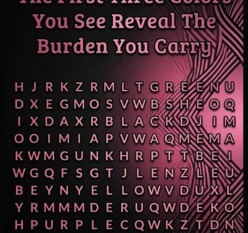
An image filled with overlapping colors promises that the first three shades a person notices will reveal the burden they carry. The exercise can be entertaining, and it may prompt reflection, but it is not a validated psychological assessment. Color perception is influenced by contrast, lighting, screen settings, eyesight and where a viewer happens to focus first.
These posts usually assign a meaning to each color. Red may be linked with pressure or anger, blue with loneliness, yellow with responsibility, green with healing and purple with hidden sensitivity. The descriptions are broad enough that many people can recognize part of themselves. That recognition is real as an emotional response, but it does not prove the image discovered a secret.
Psychologists call one relevant phenomenon the Barnum or Forer effect. People often rate general personality statements as highly accurate when they believe the statements were created specifically for them. A phrase such as “you help others but sometimes feel unappreciated” applies to a wide range of lives. When attached to a color selected moments earlier, it can feel surprisingly personal.
Attention also changes according to visual design. A bright patch near the center may be noticed before a darker color at the edge. Complementary colors make one another appear more intense. A phone’s display mode can shift saturation, while color-vision differences alter which boundaries stand out. Two people looking at the same image may literally receive different visual information.
Color does influence experience in some contexts. Designers use contrast to guide attention, and cultural associations can connect white with mourning in one place and celebration in another. Personal memories matter as well. A hospital wall, school uniform or family home may give a shade emotional weight that no universal chart can predict.
The test becomes useful when treated as a prompt rather than a verdict. After choosing three colors, a person can ask why the assigned description resonates. Are they carrying too many responsibilities? Have they avoided a difficult conversation? Do they need rest, support or a clearer boundary? The value comes from the questions and honest answers, not from the pixels diagnosing them.
It should not be used to identify depression, anxiety, trauma or another mental-health condition. Diagnosis requires a fuller history, patterns over time and assessment by a qualified professional. Someone experiencing persistent sadness, panic, sleep disruption, hopelessness or thoughts of self-harm deserves real support rather than another online personality result.
Creators can make these posts feel more responsible by labeling them as entertainment and avoiding frightening claims. Viewers should not be told that a color proves they are damaged, dangerous or destined for a particular event. Language that invites curiosity is very different from language that exploits vulnerability.
People enjoy visual tests because they offer a quick ritual of self-discovery. Choosing is easy, sharing results creates conversation and the ambiguity leaves room for imagination. Those pleasures do not require the test to be scientific.
The first three colors you see may reveal something about the image’s layout, your screen and your attention in that moment. Any deeper meaning is created through reflection. Enjoy the result, compare it with friends and keep the conclusion proportionate. A colorful puzzle can open a thoughtful conversation, but it cannot carry the weight of a psychological evaluation.
A good follow-up is to choose one real burden the description brought to mind and identify one practical response: make a call, reschedule a task, ask for help or rest. The test does not supply the insight; the viewer does. Its best outcome is not prediction, but a small honest action.
That action matters more than the color order.